excel pivot tables are a feature that you should learn how to use. Instead of analyzing countless spreadsheet records, these tables can aggregate your information and show a new perspective in a few clicks. You can also move columns to rows or vice versa. The problem is people believe creating a pivot table is difficult to learn. Grab a seat and we’ll guide you through a short tutorial so you can start data crunching. (Check Resources section at bottom for example worksheet.)
What is an Excel Pivot Table?
You might think of a pivot table as a user-created summary table of your original spreadsheet. You create the table by defining which fields to view and how the information should be displayed. Based on your field selections, Excel organizes the data so you see a different view of your data.
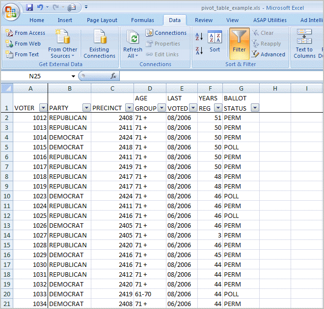
As example, I’ve uploaded a sample spreadsheet of 4000 fictitious people, which includes the following data fields:
- Voter ID
- Party Affiliation
- Their precinct
- Age group
- When they last voted
- Years they’ve been registered
- Ballot status
Looking at the first 20 voter records, you can see the content is boring. In this format, the key question it answers is how many voters exist in all the precincts.
Using Excel pivot tables, you can organize and group the same data in ways that start to answer questions such as:
- What is the party breakdown by precinct?
- Do voters use permanent absentee ballots?
- Which precincts have the most Democrats?
- How many voter pamphlets do I need for Precinct 2416?
- Do 18-21 year olds vote?
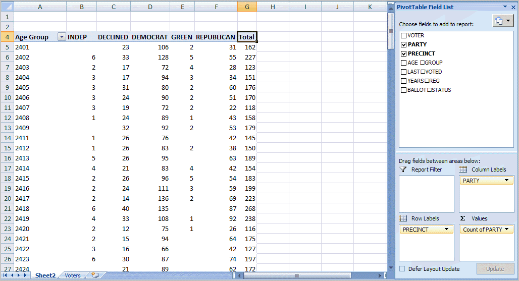
Excel pivot tables allow you to group the spreadsheet or external data source by any of your data fields. The screen snap below shows a count of voters by party by precinct.
Using a pivot table, I can continue to slice the information by selecting more fields from the PivotTable Field List. For example, I can take the same data and segment by voter age group.
Understanding the Table Structures
In the screen snap above, I’ve labeled the main areas of the pivot table.
- PivotTable Field List – this section in the top right displays the fields in your spreadsheet. You may check a field or drag it to a quadrant in the lower part.
- The lower right quadrants – this area defines where and how the data shows on your pivot table. You can have a field show in either a column or row. You may also indicate if the information should be counted, summed, averaged, filtered and so on.
- The red outlined area to the left is the result of your selections from (1) and (2). You’ll see that the only difference I made in the last pivot table was to drag the AGE GROUP field underneath the PRECINCT field in the Row Labels quadrant.
How to Create an Excel Pivot Table
There are several ways to build a pivot table. Excel has logic that knows the field type and will try to place it in the correct row or column if you check the box. For example, numeric data such as Precinct counts tends to appear to the right in columns. Textual data, such as Party would appear in rows.
While you can simply check fields to display and let Excel build your pivot table, I prefer to use the “drag and drop” method. This is partly because I like to visualize my data in columns and rows. I think it may also be easier if you have fields, which can appear to be numbers like a precinct value.
- Open your original spreadsheet and remove any blank rows or columns.
- Make sure each column has a heading, as it will be carried over to the Field List.
- Make sure your cells are properly formatted for their data type.
- Highlight your data range
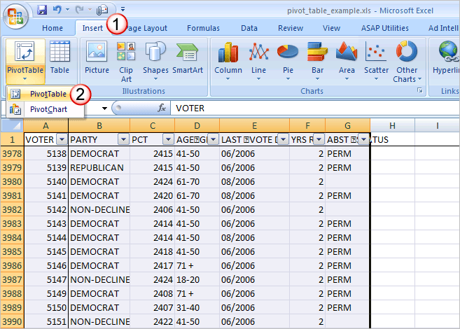
- Click the Insert tab.
- Select the PivotTable button from the Tables group.
- Select PivotTable from the list.
The Create PivotTable dialog appears.
- Double-check your Table/Range: value.
- Select the radio button for New Worksheet.
- Click OK.
A new worksheet opens with a blank pivot table. You’ll see that the fields from our source spreadsheet were carried over to the PivotTable Field List.
- Drag an item such as PRECINCT from the PivotTable Field List down to the Row Labels quadrant. The left side of your Excel spreadsheet should show a row for each precinct value. You should also see a check mark appear next to PRECINCT.
- The next step is to ask what you would like to know about each precinct. I’ll drag the PARTY field from the PivotTable Field List to the Column Labels quadrant. This will give an extra column for each party. Note that you won’t see any numerical data.
- To see the count for each party, I need to drag the same field to the Valuesquadrant. In this case, Excel determines I want a Count of PARTY. I could double-click the entry and choose another Field Setting. Excel has also added Grand Totals.
Additional Groupings and Options
As you build your Excel pivot table, you’ll probably think of more ways to group the information. For example, you might want to know the Age Range of voters by Precinct by Party. In this case, I would drag the AGE GROUP column from the PivotTable Field List down below the PRECINCT value in Row Labels.
Each age group is broken out and indented by precinct. At this stage, you might also be thinking of usability. As with a regular spreadsheet, you may manipulate the fields. For example, you might want to rename “Grand Total” to “Total” or even collapse the age values for one or more precincts. You can also hide or show rows and columns. These features work the same way as a regular spreadsheet.
One area that is different is the pivot table has its own options. You can use these options by right-clicking a cell within and selecting PivotTable Options… For example, you might only want Grand Totals for columns and not rows.
There are also ways to filter the data using the controls next to Row Labels or Column labels on the pivot table. You may also drag fields to the Report Filter quadrant.
Troubleshooting Excel Pivot Tables
You might encounter several “gotchas” with this example file or another spreadsheet. Sometimes when you move around your pivot table the PivotTable Field Listdisappears. To get it back, click any cell with a value.
You can also move or “pivot” your data by right clicking a data field on the table and selecting the “Move” menu. From here, you can move a column to a row or even change the position. An example of this might be the values for “LAST VOTED” since Excel will sort by the month first. You might prefer to move the data so the election dates are in a chronological order.
I prefer not adding fields to a pivot table. I think it’s easier to add the fields first to your source spreadsheet. The reason is you might get items out of sync if you move data unless you make them a calculated field.
Excel pivot tables may not make the election data exciting, but it can make the analysis easier. Without these tables, you’d probably spend more time filtering, sorting and subtotaling. The other benefit is that it’s easy to start over by deselecting fields or moving them to another place. Feel free to download the tutorial spreadsheet below and play with the data. This may be the only time you’re allowed to manipulate election data.
 Looking at the first 20 voter records, you can see the content is boring. In this format, the key question it answers is how many voters exist in all the precincts.
Using Excel pivot tables, you can organize and group the same data in ways that start to answer questions such as:
 Using a pivot table, I can continue to slice the information by selecting more fields from the PivotTable Field List. For example, I can take the same data and segment by voter age group.


 The Create PivotTable dialog appears.


 Each age group is broken out and indented by precinct. At this stage, you might also be thinking of usability. As with a regular spreadsheet, you may manipulate the fields. For example, you might want to rename “Grand Total” to “Total” or even collapse the age values for one or more precincts. You can also hide or show rows and columns. These features work the same way as a regular spreadsheet.
One area that is different is the pivot table has its own options. You can use these options by right-clicking a cell within and selecting PivotTable Options… For example, you might only want Grand Totals for columns and not rows.
There are also ways to filter the data using the controls next to Row Labels or Column labels on the pivot table. You may also drag fields to the Report Filter quadrant.

Không có nhận xét nào:
Đăng nhận xét